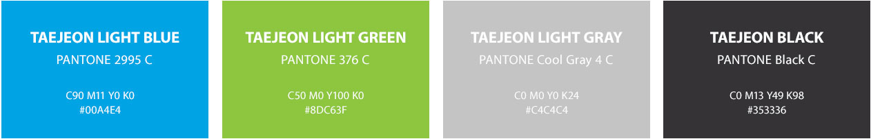
태전그룹
  • The power of a long history

    A pharmaceutical distributor with the longest history in Korea that has grown with customer-oriented thinking and win-win attitude

Corporate Identity
The symbol represents Taejeon Group's relentless pursuit to become "more than a total healthcare company."
Added to this, the Mobius Strip embodies our philosophy and vision of co-existence between corporations and consumers.

Logo
The logo of Taejeon Group is a combination of symbol mark and logotype to indicate the official name of Taejeon Group. The logo cannot be used for any purposes other than displaying the official name of Taejeon Group, and the use of the symbol mark alone is not allowed. The logo is designed in Korean and English formats, which should be used correctly following the criteria specified in this design manual to enhance the image and reliability of the company.


Logo Type
The logotype shows the official name of Taejeon Group, so it cannot be modified arbitrarily in any case.


Color System
The exclusive color of the logo is an important element that forms the identity of Taejeon Group. To use the logo effectively, it is necessary to review the printing method, ink saturation, and paper texture to maintain the color specified in the manual. Signs, silk prints, paints, and acrylics should be as close as possible to the specified standard color (Pantone color).


Corporate Signature
The signature system is a composition of the symbol, and the name “TAEJEON” written in English. The purpose of the signature system is to encourage systematic and effective usage of these images. The composition of the signature may be modified according to the guidelines and examples provided to best fit a given platform.